


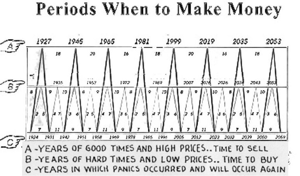
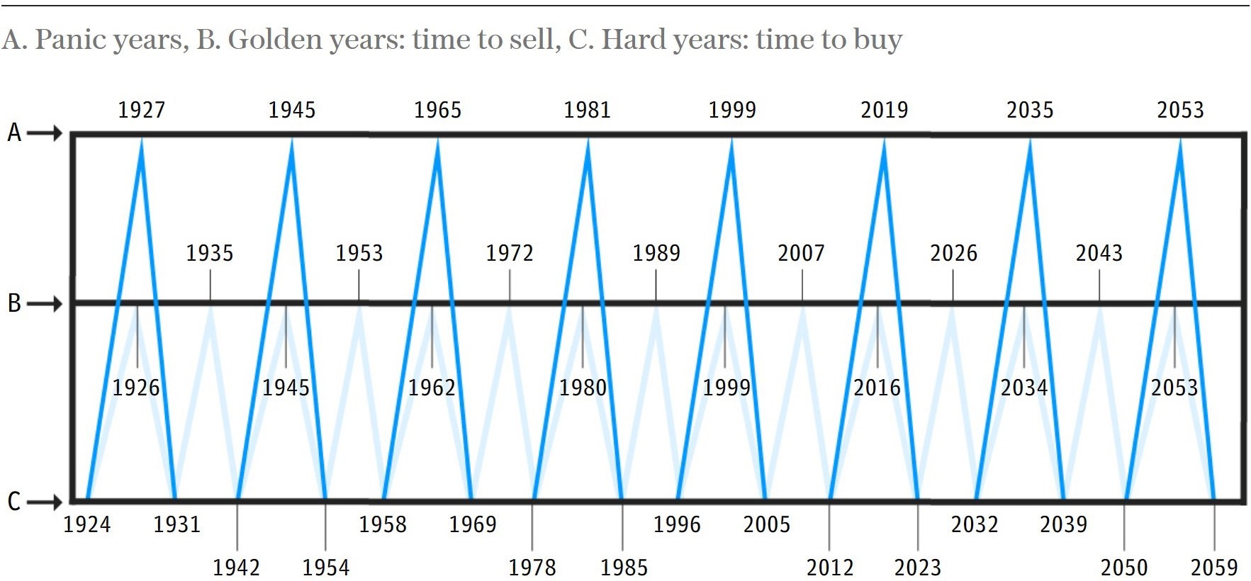
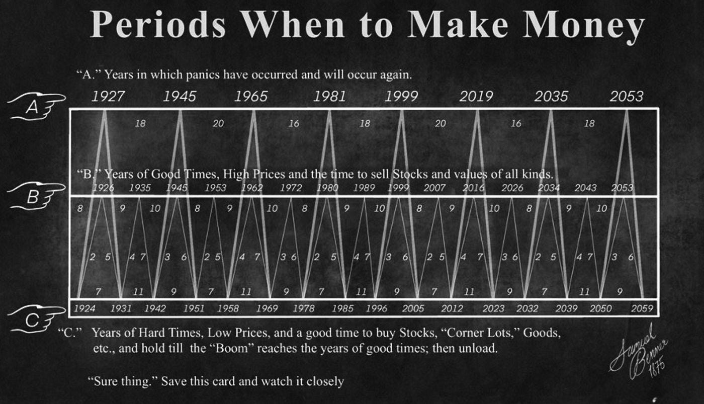
Periods When to Make Money
But Does It Really Work?

Dear Investors,
A curious publication titled Periods When to Make Money has taken social media by storm.
Promising to reveal the best times to cash in on stock market gains, it’s no wonder people are excited—especially with the S&P 500 Index already down 6% year-to-date (YTD).
The chart, credited to George Tritch (with some debate about Samuel Benner’s involvement), labels specific years as either “Years of Panic,” “Years of Good Times,” or “Years of Hard Times,” offering a simple guide for when to buy or sell stocks.
But how reliable are these predictions?
I’ll dig into the historical performance of these cycles using S&P 500 data and compare them to the tried-and-true buy-and-hold strategy.
Spoiler alert: timing the market is harder than it looks.
Market Timing
Humans love a good shortcut.
While complex financial models drown us in data, a straightforward chart feels like a breath of fresh air.
That’s the appeal of Periods When to Make Money. It breaks down market cycles into three tidy categories:
Years of Panic (A): When big losses loom, and the chart suggests staying out—or even betting against—the market.
Years of Good Times (B): The signal to sell and lock in profits.
Years of Hard Times (C): The time to buy stocks on the cheap.
At first glance, the chart seems prescient.
It flagged 1927 (before the Great Depression), 1999 (pre-dotcom crash), 2007 (pre-financial crisis), and 2019 (pre-COVID-19) as times to sell, and now it’s calling 2023 a buying opportunity.
With the S&P 500’s solid start this year, it’s easy to see why reposts are flooding X and TikTok.
But as any seasoned investor knows, market timing is a tricky beast.
The age-old debate of “Timing the Market” versus “Time in the Market” looms large.
Does this chart hold up under scrutiny, or is it just another shiny distraction?
Testing the Chart
To find out, let’s analyze how the stock market—represented by the S&P 500 Index—performed during the transitions between these labeled years.
I’ll use historical price data from Robert Shiller’s Yale University dataset, spanning January 1877 to April 2023, and examine three key cycles: Hard Times to Good Times (C to B), Hard Times to Panic (C to A), and Panic to Hard Times (A to C).
1. Hard Times to Good Times (C to B)
This cycle suggests buying in tough times and selling when the market peaks.
Here’s how it played out:

Takeaway: With an 81.25% hit rate (positive returns in 13 of 16 periods) and an average gain of 32.12%, this cycle looks promising.
Highlights include a 103.24% surge before the dotcom bubble.
But the Great Depression’s -42.05% loss from 1931-1935 shows it’s not foolproof—it dodged the 1929 crash but got caught in the aftermath.
2. Hard Times to Panic (C to A)
These longer, less frequent cycles also start with buying in Hard Times but end in Panic years:

Takeaway: An 87.5% hit rate and a hefty 61.66% average return make this cycle stand out. Only one period (1888-1891) lost money.
The longer timeframes—like 1958-1965’s 109.44% gain—boost the averages, but these opportunities are rare.
3. Panic to Hard Times (A to C)
Here’s where the chart expects losses, suggesting investors sit out or short the market:

Takeaway: This is the chart’s weak spot.
With a dismal 37.5% hit rate, only 3 of 8 periods were negative.
The market often rose—like 57.23% from 1945-1951 or 51.9% from 2019-2023—meaning staying out (or shorting) would’ve cost you big gains.
Timing vs. Staying Invested
Numbers alone don’t tell the full story.
Let’s backtest three strategies based on the chart against the buy-and-hold approach, starting with $100 in 1904 and ending in April 2023:
Strategy 1: Buy in C, Sell in B
Invest only during short C-to-B cycles, then sit out.
Result: Misses too many upswings, especially post-WWII. Performance lags significantly.Strategy 2: Buy in C, Sell in A (long cycles) or B (short cycles)
Stay invested longer, mixing long and short cycles, always long positions.
Result: Grows $100 to $5,432. It limits some downturns (e.g., 1937, 2000, 2008) but still trails.Strategy 3: Buy in C, Short in A (long cycles), Sell in B (short cycles)
Adds short-selling during A-to-C periods.
Result: Worst performer. The 37.5% hit rate in Panic years means shorting often backfires.Buy-and-Hold: Stay Invested Always
Result: Turns $100 into $62,414—a 12-fold lead over Strategy 2.
The Verdict: Buy-and-hold crushes the competition.
Strategy 2 performs best among the timing options, but its $5,432 pales next to $62,414.

Why? Being out of the market—or betting against it—misses massive gains, especially during unexpected recoveries like post-COVID.
Why Market Timing Falls Short
The Periods When to Make Money chart has its moments.
Its simplicity is its strength, fueling shares and likes across social media.
Periods When to Make Money is a captivating idea.
It flags years near major crashes—1927, 1999, 2007—but it’s not precise enough.
History tells a different story: market timing, even with a clever chart, can’t consistently beat the power of staying invested.
For every crash it sidesteps, it misses multiple booms.
Bull markets often peak with explosive returns, and recoveries can be swift (think 2020). Sitting out or shorting during “Panic” years risks missing the boat entirely.
The opportunity cost of not being invested outweighs the occasional dodge of a downturn.

So, next time you see it pop up in your feed, enjoy the nostalgia—but don’t ditch your long-term plan.
Time in the market still reigns supreme!
Sincerely,
The Pareto Investor